R 散点图
散点图显示在笛卡尔平面中绘制的许多点。 每个点表示两个变量的值。 在水平轴上选择一个变量,在垂直轴上选择另一个变量。使用plot()函数创建简单散点图。
语法
在R语言中创建散点图的基本语法
plot(x, y, main, xlab, ylab, xlim, ylim, axes)
以下是所使用的参数的描述
x是其值为水平坐标的数据集。
y是其值是垂直坐标的数据集。
main要是图形的图块。
xlab是水平轴上的标签。
ylab是垂直轴上的标签。
xlim是用于绘图的x的值的极限。
ylim是用于绘图的y的值的极限。
axes指示是否应在绘图上绘制两个轴。
实例
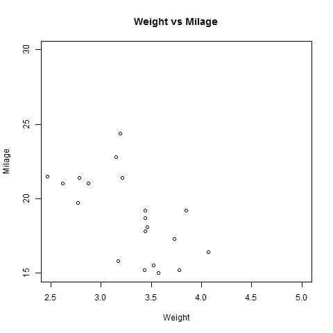
我们使用R语言环境中可用的数据集“mtcars”来创建基本散点图。 让我们使用mtcars中的“wt”和“mpg”列。
input <- mtcars[,c('wt','mpg')]print(head(input))
当我们执行上面的代码,它产生以下结果:
wt mpgMazda RX4 2.620 21.0Mazda RX4 Wag 2.875 21.0Datsun 710 2.320 22.8Hornet 4 Drive 3.215 21.4Hornet Sportabout 3.440 18.7Valiant 3.460 18.1
创建散点图
以下脚本将为wt(重量)和mpg(英里/加仑)之间的关系创建一个散点图。
# Get the input values.input <- mtcars[,c('wt','mpg')]# Give the chart file a name.png(file = "scatterplot.png")# Plot the chart for cars with weight between 2.5 to 5 and mileage between 15 and 30.plot(x = input$wt,y = input$mpg,xlab = "Weight",ylab = "Milage",xlim = c(2.5,5),ylim = c(15,30),main = "Weight vs Milage")# Save the file.dev.off()
当我们执行上面的代码,它产生以下结果:
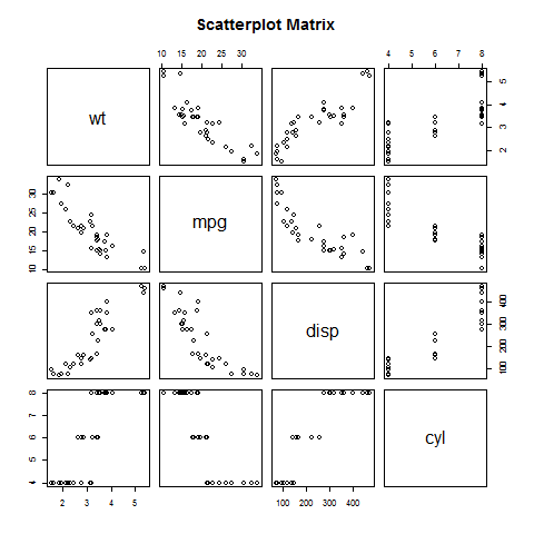
散点图矩阵
当我们有两个以上的变量,我们想找到一个变量和其余变量之间的相关性,我们使用散点图矩阵。 我们使用pairs()函数创建散点图的矩阵。
语法
在R中创建散点图矩阵的基本语法
pairs(formula, data)
以下是所使用的参数的描述
formula表示成对使用的一系列变量。
data表示将从其获取变量的数据集。
实例
每个变量与每个剩余变量配对。 为每对绘制散点图。
# Give the chart file a name.png(file = "scatterplot_matrices.png")# Plot the matrices between 4 variables giving 12 plots.# One variable with 3 others and total 4 variables.pairs(~wt+mpg+disp+cyl,data = mtcars,main = "Scatterplot Matrix")# Save the file.dev.off()
当执行上面的代码中,我们得到以下输出。